Friday, May 15, 2015

FROM EAST COAST TO WEST COAST


The last few weeks have been busy ones as we have been saying our goodbyes for the summer and packing up to drive across the country. We've enjoyed many parties and bonfires with friends as we are preparing to go separate ways for now.

Caleb has a summer internship in the San Francisco Bay Area, so we will be there for 10 weeks. Neither of us has ever been to California so it should be a good adventure. To make it more adventurous (and because we will need a car), we are driving there. From New York to California. Over 3,000 miles. Over 40 hours across the United States of America.
We've already started the journey even though we don't have to be there until June 1st. A long trip like this is probably better done in segments. We're planning to see many friends and family along the way.


Our first stop was Nashville, TN. Since I used to work in Nashville, I have former coworkers and church friends that we stayed with and met up with to say hello. I can't believe it has been 1.5 years since leaving...it's a great city.

Of course we couldn't stop in Nashville without venturing back to the very spot where we got engaged: the Shelby Street Pedestrian Bridge. {Side note: why don't they shoot a Batman movie in this city? It would be perfect with the AT&T Building! You can see it in this picture, but not from a good angle...just Google it.}

Also, I had to see Hatch Show Print again because I'm a print nerd.

Sunday, May 03, 2015

EXPLORING THE FARMERS MARKET


This weekend Caleb and I finally ventured out to the Farmers Market. I think it's a very pretty place to go with all of the fresh produce and products from all types of vendors. And this market is also right on the lake, so that's a major plus for aesthetics. It makes for a nice and relaxing stroll, especially when the weather is pleasant like it was this weekend.

When it comes to Farmers Markets (or really any type of shopping outside of grocery), I'm strictly a browser. It's just that I don't need a whole lot...especially if I'm in a store for the first time. I like to see what's available and make a mental note so I can come back if I ever need/want what's being offered. I prefer to make informed purchases, and I should probably mention that I'm pretty frugal. My hard-earned money more often is saved than spent. But I don't regret any of that one bit.

One thing that I enjoy about exploring, whether it's the Farmers Market or anywhere, is the new perspective I get. Exploration = Inspiration. Seeing new things or doing new things helps to bump my creativity up a notch. I think that's one reason why I have decided to keep a blog. I hope it encourages me to keep looking for the new in life, even everyday life. And I hope to translate that inspiration into more artwork, since that really is my trade.

I miss doing art. I'm a creator at heart. I like to say, "Hey, I made that!" I've known that about myself since I was very young, so I don't think it's ever going away. Hopefully I can share new projects I'm working on very soon...but there may also be a lot of exploring before that happens :)

Thursday, April 30, 2015

DESTINATION: NIAGARA FALLS


Before April is over I should share the rest of my adventures from the month. The same week I traveled to NYC, I also drove over to Niagara Falls (my back was hurting from the driving, but it was worth it). Everything was still thawing out at the falls, and there were very large chunks of ice clinging to the rocks below them, despite the raging waters. I don't understand how all the power from the falling water wouldn't knock the ice and snow away, but that's part of the wonder I guess.


That was also my second time seeing the falls. The first time was in October of 2012 with my friend Hannah. {She was the only one crazy enough to drive the long way with me over a quick, three-day weekend.} We saw it from the Canadian side (as that was the fastest route for us...over the Ambassador Bridge via Michigan), but it turns out that the Canadian side is the best side to view the falls from.


No worries though, if you are on the American side (as I was this time), you can easily travel to Canada via the Rainbow Bridge. If you are just going to see the falls and not traveling to other establishments, I would recommend walking across the bridge instead of driving (just remember to bring your passport!). The line of cars to get from one country to another looked like such a long wait (probably over 30 minutes on the average day we went). Also, if you drive you pay a higher toll to cross the bridge. You pay a 50 cent toll when walking back to America, but hey, the view is pretty good for the price.

Of the times I've been to Niagara, I would say the autumn is DEFINITELY a great time to visit. The leaves on the trees are so beautiful at that time. (Also, the tourism isn't so crazy because it's an off season.) But the trees are such a wonderful contrast to the blue/green waters of the Niagara River during the fall. I love the color in the water here in New York. In Wisconsin, where I'm from, the water was always muddy looking. In New York it has that green patina. I'm sure it has a lot to do with the soil as I have noticed the soil being much more red in color here.

If you are in Canada, a great place to eat is The Syndicate Restaurant and Brewery...seriously the best burger I've ever had was made there.

Thursday, April 23, 2015

A BEGINNER'S GUIDE TO NYC


We've had a few visitors the past couple weeks which has left me a little exhausted. However, it's been good to get out and see the sights around the state. I've driven from one side of NY to the other, so I have a few suggestions of things to see.

I'll start with the big one: New York City!!! I didn't know until moving to New York state that much of it is country. Over half the population lives in or around NYC, so that leaves a whole lotta beautiful country for everyone else.

Honestly, I've now been to NYC just twice in my life. The first time I went with a friend back in 2012. It was very intimidating to me, a born-and-raised country gal. I thought it was dirty, expensive, and over-crowded. Ultimately, over-rated, and I didn't really want to return. (Although, it was good to see the place just once to know that.)

Well, I am glad I went again because the city is not so scary or gross to me anymore. I kind of want to go back and see a bunch more actually...I guess it's a place that grows on you. I think that living in Washington, D.C. has helped me adjust to "big" city life...especially driving in the city and understanding the metro system.

Before going to NYC, it's extremely helpful to download an app for the subway system if you're unsure of exactly where to go. I really liked one called Embark NYC. It's pretty easy to use. Best of all, it allows you to look at the metro map and the stops/train changes you need to make even if you don't have cellular signal (which happens often on underground transportation).

Anyway, if you've got a few days to spend in NYC and need some sights to see, I have a few suggestions. This is by far not a comprehensive list nor in any order.
This is probably NYC LEVEL: BEGINNER. (Also very good if you're on a budget like me.)


1.  THE STATUE OF LIBERTY VIA THE STATEN ISLAND FERRY

I know a lot of people see Lady Liberty any number of ways, but I thought that riding the {FREE} Staten Island Ferry was a great experience. The ferry operates throughout the entire day on a 15/30 minute schedule depending on when you ride. It offers a fantastic view of The Statue of Liberty, Ellis Island, and Lower Manhattan. The ferry is very clean and you can even check out the views from on deck. This is definitely the way to go...especially because it will allow you to save your dollars (or allow you to spend them elsewhere in the city).


2. ONE WORLD TRADE CENTER - 9/11 MEMORIAL

It's kind of crazy to think that the 9/11 attacks happened over 14 years years ago and that a new World Trade Center is already up and running. I remember that day quite well...and I was only an eighth grader in the Midwest. Visiting the memorial is so beautiful and impactful. It really captures the memory of the buildings and the people who lost their lives that day. I didn't see the museum, but I'm sure it's just as impactful. The memorial itself is outside and free, but a museum ticket costs $24 for adults. I have pictures of the memorial, but honestly, seeing it in person is how you should do it. Being there, I can't image how chaotic that day was in 2001 or how the search and clean-up happened afterwards. It just confounds me how something like that could ever occur there (or anywhere really).

3. CHELSEA MARKET

The Chelsea Market is the cutest little stop and shop. Built in a former Nabisco factory (where the Oreo cookie was invented), it blends the industrial and urban with the quaint small-town market feel. You will fall in LOVE with this place. It's worth the trip and is a great place to grab a bite to eat and look at handcrafted items. Apparently above the Chelsea Market lies the HighLine, an urban oasis that repurposes an old railway into a parkway...that's something I'll have to see next time.

4. ROCKEFELLER CENTER

There are so many attractions to find in Rockefeller Center...from the shops and restaurants to the buildings and businesses surrounding the area. It's home to the Today Show, NBC, Radio City, The Tonight Show, the Associated Press, and Lego, among other well known entities. In the wintertime you'll find the iconic New York Christmas Tree and a beautiful skating rink. You can also check out an amazing view of NYC from Top of theRock.


5. CENTRAL PARK

I would say Central Park is one of the most iconic landmarks in NYC. It was certainly on the top of my list of places to see when first visiting the city. It's such a refreshing escape from the hustle and bustle of the city surrounding it. If not for the towering skyscrapers around it, you may actually forget you were in NYC and could easily get lost in its 843 acres. Explore the nature, the art and architecture, skating rink and ponds, or even the Central Park Zoo.

6. TIMES SQUARE

Funny enough, I don't even have a picture of Times Square. I am not a huge fan of the place, to be honest. I'm only including it in my list because I think it's one of New York's major attractions and good to see at least once (even if it's just for a minute...which is usually what it is for me). Times Square is NYC in a nutshell: lights, people, shows, events. I suppose that's why it's so popular. One thing I for sure want to do yet is see a Broadway production, and this is the place to do that.

7. THE METROPOLITAN MUSEUM OF ART (THE MET)

The Met is the largest art museum in the United States. It's worth the trip for that. You could spend all day in the museum. I spent a few hours and focused on my favorites: drawings, prints, stained glass, American, and the European masters. I'm not sure how many people know this, but the price for the adult ticket is only a "recommended" price. You can pay what you want. Now, if I were to spend the whole day in The Met, I would probably pay the whole price, but for just a few hours I prorated it. I would still love to se the MoMA which houses Van Gogh's Starry Night. The Guggenheim has wonderful architecture, but unless you are absolutely in love with their current exhibition it's probably not worth it over The Met or MoMA.


8. GRAND CENTRAL STATION

Grand Central Station is filled with shops and dining and is a great little point where many tracks diverge. Literally. It's worth the stop to enjoy the beauty and grandiosity of the architecture. And if this is your transportation into or out of the city, even better.

Hopefully this short list gives you some good starting points to see on your first visit to NYC. There are so many more wonderful sights to see outside of this list. I definitely still want to see a Broadway production, go to the Tonight Show, the Brooklyn Bridge, see the Christmas Tree in Rockefeller Center, go to Coney Island, see Wall Street, go to the American Museum of Natural History, and ring the Stock Market Bell (haha...maybe someday). But hey, this all gives me reason to go back again...hopefully soon.

What places have you enjoyed while in NYC? I'd love to hear all the wonderful places, especially the ones that are off the beaten path.

Friday, April 17, 2015

NEW SEASON = NEW WREATH


Since Caleb and I got married and moved into our first apartment, I've made a new wreath for each of the seasons. These wreaths were made without spending any money, too. That's because we're on a bit of a grad school budget over here (aka: only the necessities). But really, it hasn't been hard to make nice looking wreaths while just using materials I already have lying around.

Here's what I did for fall and winter:


For the fall wreath I used a coat hanger, paper clips, hot glue, pinecones spray-painted teal, and chevron burlap ribbon (the ribbon and pinecones were leftover from our wedding).

For the winter wreath I used cardboard, hot glue, paper straws, jute twine, and white acrylic paint (again, the twine and straws were leftover from our wedding).

For spring I wanted to break away from the color scheme we used for our wedding. I also wanted to do something that I could leave up for spring and summer because we'll be moving (temporarily) for the entire summer.

I found this gorgeous wreath on Jones Design Company and knew I wanted to do something similar.
I followed her tutorial for turning coffee filters into paper flowers. It seemed daunting at first, but the more I made the flowers, the easier it got.

I only used three colors of paint: white, yellow, red. I toned down both the red and yellow with white and mixed water with each of them, thus resulting in two colors. For some flowers I only used the red mixture to dye the coffee filters. For others I used only the yellow. And for a third variation I dipped a filter in red and then in yellow. I just played around with the tones and diluted the filters if I thought they had too much color. For the final wreath I also used undyed coffee filters for the white flowers.

Here are my filters as they were drying:


Once dry, I shaped them all into flowers and hot-glued them to a cardboard circle. It took a little while, but I really like how it looks (and it was free!). I think I may even make a few more and attach them to sticks to look like stems...because the flowers looked real pretty in a glass jar.

Wednesday, April 15, 2015

MORE FROM OUR SPRING BREAK


One good thing about being the wife of a grad student is the fact that we get those holiday/seasonal breaks again. We're not limited to the two weeks of vacation at our everyday jobs. It was really nice over Christmas to have over a month off so that we could visit both of our families since they are in different states.
For spring break/Easter we were in Connecticut because it's much closer to go there for a short holiday break and spend time with family friends. While there, we usually make a point to see a landmark or do an "authentic" activity.
This time we made our way to the beach...for a short little time. It was very windy and cold (it's still early spring!), but the sunshine was great! I haven't seen the Atlantic Ocean a whole lot, but this year, I'll have the chance to see the Atlantic and Pacific.


We also wandered through the Yale University Art Gallery. I liked it A LOT. From what I've seen, I think that Ivy League schools have much better collections than the more established art museums. Most of the time it's less crowded and free to get into them as well...major plus! But seriously, the Yale and Princeton galleries have works of many major artists...at least ones I really like (i.e. Degas, Van Gogh, Rauschenberg, etc.). The architecture on the campuses is really beautiful, too.


I especially liked the special exhibit Yale had on James Abbott McNeill Whistler's etchings. I'm a sucker for the prints and drawings sections...printmaking is my thing. Whistler's work was very fascinating. I love how detailed he was and it's pretty incredible how many unique prints he made in his lifetime considering that wasn't his only art niche. If you have a chance to see the exhibit through July 19, 2015, then do it!!

Saturday, April 11, 2015

EASTER EGG CRAYON BATIKING


Hopefully everyone had a great Easter. My husband and I traveled to Connecticut for a long weekend with some family friends. We had a good time...we always do.

One of the things we did was dye hard-boiled eggs. I got out a white crayon and tried my hand at some amateur batiking. I thought the eggs turned out pretty well.

It's very easy to do: Just outline in crayon what you want to keep white. Then dye the egg (preferably, you want to dye your egg with the lightest color first). Once dry, use the white crayon to color over the areas you want to keep the color you just dyed the egg. Then dye with your next color. You could go on with several colors. I liked the three-color look.

I love the look of actual batiked eggs, but doing crayon batiking was within my abilities...for now. Maybe in the future I'll take it up :)

Here's our whole carton:


Saturday, April 04, 2015

DIY PICTURE FRAME CHALKBOARD


Finally it's been feeling more like spring in upstate NY! It's been a loooong winter for sure. (The second coldest on record I heard.) So I was definitely on top of it when the first jacket-less day rolled around...full on spring cleaning with opened windows. I love getting fresh air into the apartment and getting that dank winter smell out.

With all that spring cleaning came my first DIY for the blog. I've been thinking about adding a chalkboard to our little dining room area for a while, but didn't really want to spend much money. So I used a cheapy frame I had lying around. Sorry no "before" picture, but the frame below is very similar, and I had all of the supplies already: chalkboard spray paint, white acrylic craft paint, paintbrush, chalk.


This was all very simple and didn't take long to transform at all. I just removed the glass from the frame and painted on several coats (like 3-4) of the chalkboard paint, making sure to let each coat dry completely before adding more. The frame was a very gaudy gold, and I wanted to tone it down a bit but still allow the gold to show through. So I painted the white acrylic paint lightly over the cleaned frame with a brush and then wiped away areas where I thought there was excess. Once everything was dry I put the frame back together and seasoned the chalkboard. The part that took the longest was the writing.

Tuesday, March 31, 2015

LOGO CREATION | PART 3: COLOR + SAVING FILES

In order to create the colored portion of my logo, I first created a little gouache painting (similar to watercolor) of the yellow sign that I wanted to include behind the type. I like the look that a small handmade portion of the logo gives for use on the blog. It's a good contrast to the bold graphic quality of the letters/arrow and adds an element of fun.

After creating the painting, I took a picture of it. Here is the unedited picture (kind of dark...I know):


Once I had the photo, I opened it up in Photoshop (PS) to do a little editing.

It's always a good rule to copy your background layer into a new layer (within the Layers window). Do this just in case you have to revert back to it (it happens more than you would think).
Once I had a copy of my background, I brightened the image. There are many ways to brighten a picture in PS, but I like to go to Image>Adjustments>Brightness/Contrast. In this case, I adjusted both the brightness and the contrast to brighten the whole image and to keep some of the texture from the paper...I like the texture.


Next, I cut out the colored part of the image. I did this by using the Quick Selection Tool. I selected the portion I wanted (to subtract portions, just hold the Option/Alt key and select) and went to Select>Inverse. Now the portion selected is the background and not the colored part. I hit the Delete button to get rid of it so that my new background is transparent. (I also deleted the original background image.)

I wanted a transparent background in this case because the background on my blog is white, and it would be nearly impossible to get my .jpg image to replicate the same white. I also changed the size of the background to fit the pixel dimensions of my blog header: under Image>Canvas Size. I also added guides to my document so that I would be able to center everything easier.

Next, I layered the black graphics I made in Illustrator over the top of the colored portion. I opened my .eps file in PS and selected all of the layer (Command/Ctrl+A), copied it (Command/Ctrl+C), and pasted it (Command/Ctrl+V) into my already open PS document (seen above). With the Move Tool I could position the lettering where I wanted it. By pressing Command/Ctrl+T I was able to adjust the size of the graphics in relation to the yellow sign (remember to hold the shift key to avoid any stretching).


Once I had everything centered and the sizes I wanted, I save my file first as a Photoshop file or .psd. That way if I need to adjust anything in the future, I can edit the layers individually. I also saved the file as a .png. A .png is basically a vector type file for the web. It can maintain a transparent background (unlike a .jpg) and also retains the crisp edges that vector files are known for.

Pro-tip: Never use a .png file for print or you'll end up with a weird box around your image. Use a .eps instead.

That's how my logo was done, people. Let me know if you have any questions.

Friday, March 27, 2015

LOGO CREATION | PART 2: WHERE THE MAGIC HAPPENS

Okay. As promised, here is the next part to my blog's logo creation. In my opinion, this is the more difficult part (and the part most designers have gone to school for (READ: get paid for), so you should feel very lucky that I'm letting you in on this secret ;) ).

With a pencil and paper it's very easy to add or take away whatever lines you want. Your imagination is the limit. But on a computer, you have to work with what you've got. That's why it's important to start with strong elements that will help you graphically (i.e. images/text with simple and clean lines...these will be the easiest to make into vector art for your logo).

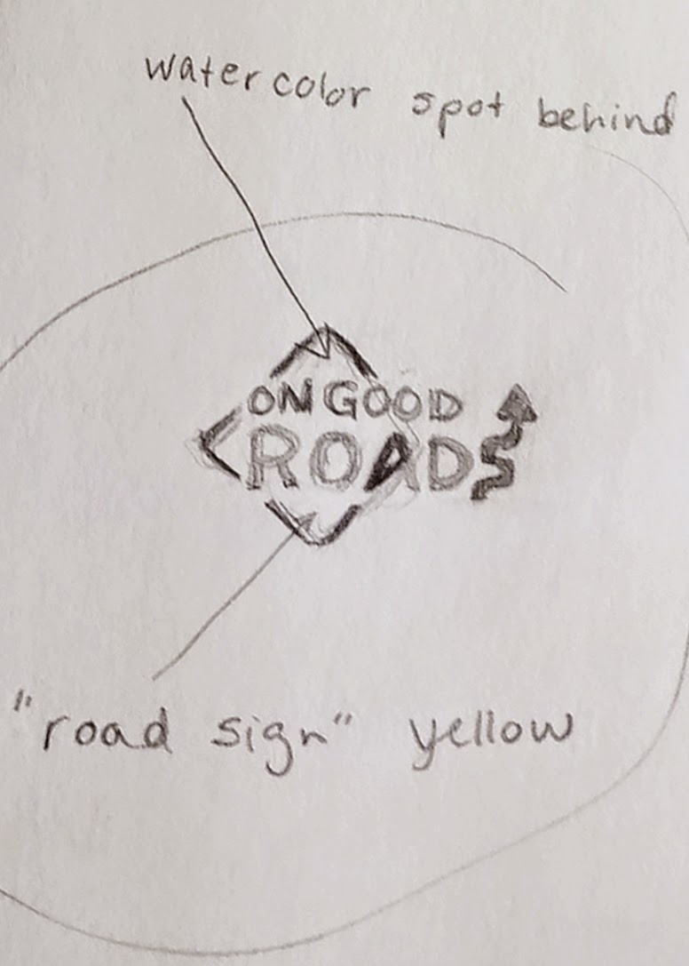
If you remember, I'm starting from this sketch:


{Note: I'm just showing you how I created my design. There may be several ways to achieve the same results. Additionally, I'm simplifying the process because I created drafts of the logo and went back over it several times to modify the parts I didn't like or that didn't look great on the web...I'm just showing how to get to the final result.}

I decided to begin with making the arrow that acts as the "S" in Roads. I looked for a picture of a road sign with a similar arrow. I found one on the internet through a basic search (it definitely didn't have to be from the internet, but it's the easiest way to go.) Please be aware of copyright if you plan to copy any pictures from the internet. If you copy anything, make sure you are only using it to create a unique image of your own.

Designer sidenote: It's frustrating when people ask you to just copy something from the internet or make it look exactly like someone else's work. That's called stealing. Wouldn't you be mad if someone stole something you worked hard on and tried to pass it off as their own?

Anywaaaay...............
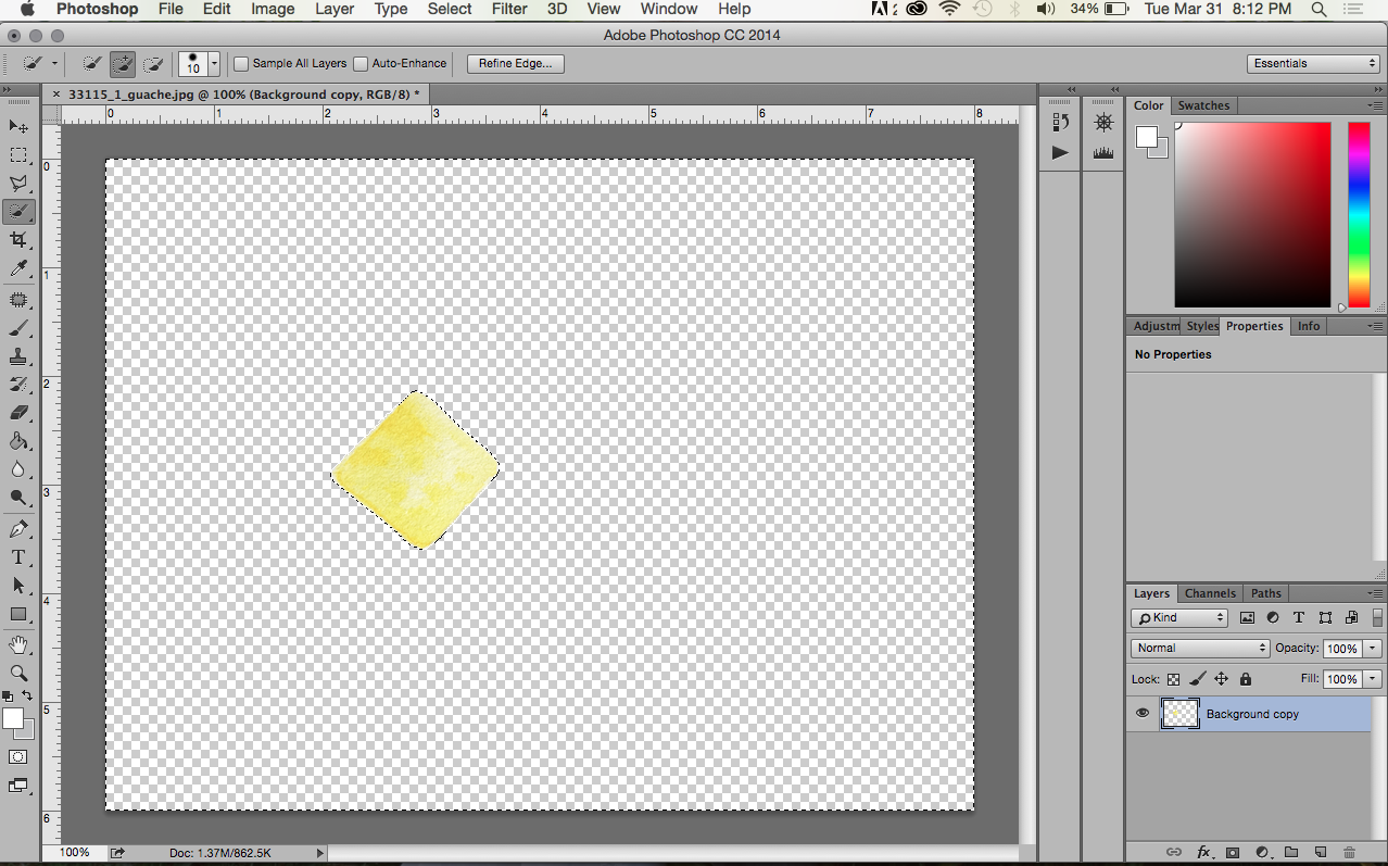
Once I found a picture I wanted, I copied it to my desktop and placed it into a new document in Adobe Illustrator. The document type doesn't really matter, I just used what was default for me (8.5x11 print).

{You'll have to excuse me as I'm still using CS3 on my personal computer (it works just fine for my needs!).}


When I placed my image into the document it was a little larger than I needed so I used the Selection Tool (black arrow) and held down the Shift key while dragging one of the white boxes in the corner of the image to resize it. It's very important to hold the shift key so that you don't stretch the original image. I see this is a very common problem for amateurs, and it makes for a very sad image.

Next, I clicked the Live Trace button in the toolbar at the top. This is my favorite feature in AI. It's magical. Essentially it turns an image from raster to vector. You want your logo to be in vector format because it's very crisp (it uses points vs. pixels) and can be easily scaled to any size without losing quality. There are different settings you can manipulate when using Live Trace, but because I picked a picture that was fairly graphic in the first place, I didn't have to change anything. Easy. To exit the Live Trace feature, I clicked Expand.

From there I right-clicked and ungrouped the pieces. I deleted all the elements except the arrow that I wanted to use. Then I created two text boxes with the Type Tool (the T). In one box I wrote "ON GOOD," and in the other, "ROADS." I did this so that it would be easy to move the two lines of type around freely. Once I had the blog name written out, I picked a font that I thought went well with the image I wanted to convey. I decided on a simple san serif that looks much like the type you would find on a road sign. I adjusted the kerning and tracking in some places to look better.
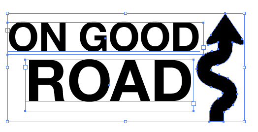
So here's where my logo was after all that work. My husband suggested making the arrow look more like the letter "S," and I agreed. To do that I had to use the Direct Selection Tool (white arrow). I moved the individual points at the bottom of the arrow to curve around a little more to the left. I also added an additional point with the Pen Tool to achieve that look.

Once I had everything arranged and looking nice I saved my file as a .ai (in case I have to go back and change anything in the original file) and as an .eps (this is one of several ways to save a vector image, and it's a file that I could import into Photoshop for the rest of my logo work).

I will have to explain the colored portion of the logo in a Part 3. Stay tuned.

Wednesday, March 25, 2015

LOGO CREATION | PART 1: BEHIND THE SCENES

A blog is a work in progress (at least that's how I'm seeing it). If you somehow discovered this blog on the very first days I posted, it looked quite a bit different than it does now. That's because I'm still figuring everything out (i.e. where to put columns and text, what pictures to include, how different fonts look together). These sort of things take time.

Today, I'm working on getting a logo in place so that this site doesn't look so much like a stock template. Here's where my logo was in the beginning:
Yeah, it's pretty bad. Nothing fancy. Aligned to the left. Gross for a blog title or capturing anyone's attention.

To begin (well, once you've determined a name for you blog/brand/etc, (which can take a while)), I like to sketch out my ideas. We're talking old school pencil and paper. It's so much easier to start on paper as it offers more freedom for you to jot down ideas. Incorporate things that you want to convey. Maybe your company is about coffee, so you want to include a coffee cup or a coffee bean or just a coffee ring leftover on a piece of paper. Whatever you think up, draw it! It doesn't have to be that great, just a sketch. Here are some of my sketches:


After I knew my blog/brand would be called "On Good Roads," I determined I wanted to include something about driving in the logo. I like road signs and did a basic web search for "road signs" to give me some ideas of where to start. I thought the car idea (above) was cute at first, but it was just too bulky for a logo. I had also brainstormed about turning the "A" in Roads into a vanishing point for a road disappearing into the horizon. But before I got to sketching that, I tried out a curved arrow as the "S" in Roads and really liked how that was looking.

{When creating a logo, I think it's best to start in black and white because, chances are, at some point you will need a basic black and white logo for printing (if you are serious about your brand anyway). Also, anything designed in black and white will look good in color. I promise.}


To add a touch of color and a nice "handmade" component to the logo, I decided to do a little spot of gauche (similar to watercolor) in the background. I pulled out my supplies...just used an old scrap piece of paper to paint on. It didn't need to be that big because I knew I could manipulate it on the computer later. The spot of color is yellow and in the shape of a road sign to further solidify my idea and make a cohesive logo. 


In Part 2 I'll explain the computer end of my logo work.

Tuesday, March 24, 2015

DELIVERED TO YOUR SCREEN FROM APT. 23


Hello there. From our sweet little apartment to yours
(or your car, or house, or boat, or wherever you are).

P.S. I may have locked myself out of our apartment for this picture. You're welcome.