Tuesday, March 31, 2015

LOGO CREATION | PART 3: COLOR + SAVING FILES

In order to create the colored portion of my logo, I first created a little gouache painting (similar to watercolor) of the yellow sign that I wanted to include behind the type. I like the look that a small handmade portion of the logo gives for use on the blog. It's a good contrast to the bold graphic quality of the letters/arrow and adds an element of fun.

After creating the painting, I took a picture of it. Here is the unedited picture (kind of dark...I know):


Once I had the photo, I opened it up in Photoshop (PS) to do a little editing.

It's always a good rule to copy your background layer into a new layer (within the Layers window). Do this just in case you have to revert back to it (it happens more than you would think).
Once I had a copy of my background, I brightened the image. There are many ways to brighten a picture in PS, but I like to go to Image>Adjustments>Brightness/Contrast. In this case, I adjusted both the brightness and the contrast to brighten the whole image and to keep some of the texture from the paper...I like the texture.


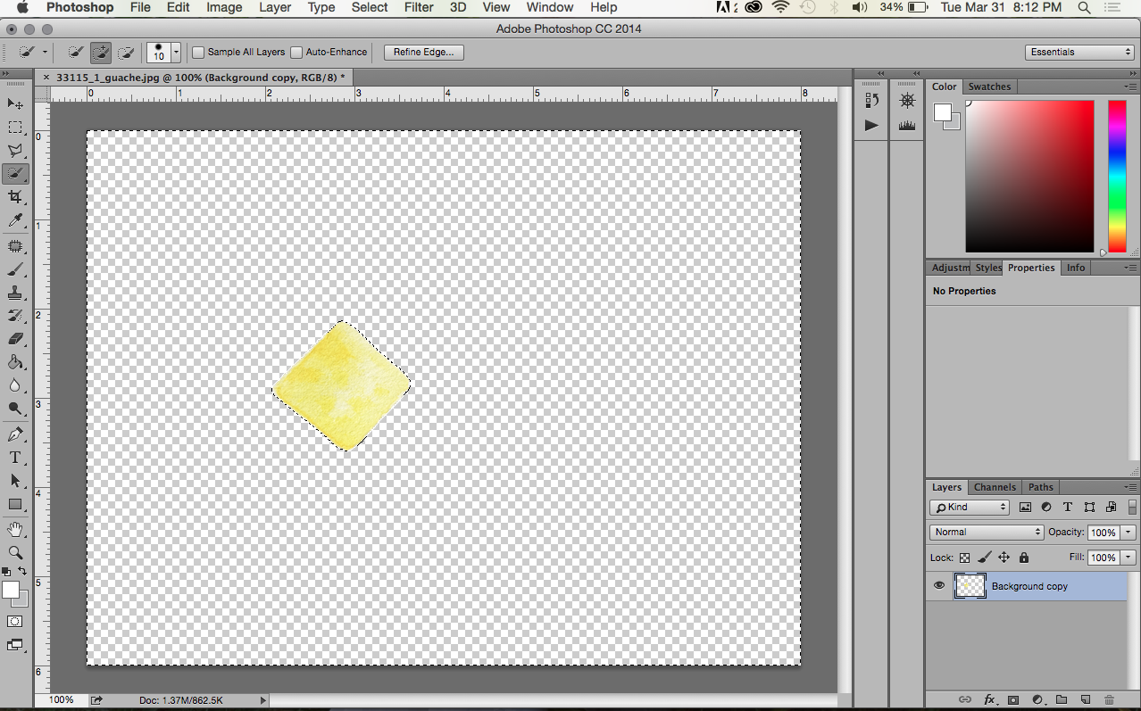
Next, I cut out the colored part of the image. I did this by using the Quick Selection Tool. I selected the portion I wanted (to subtract portions, just hold the Option/Alt key and select) and went to Select>Inverse. Now the portion selected is the background and not the colored part. I hit the Delete button to get rid of it so that my new background is transparent. (I also deleted the original background image.)

I wanted a transparent background in this case because the background on my blog is white, and it would be nearly impossible to get my .jpg image to replicate the same white. I also changed the size of the background to fit the pixel dimensions of my blog header: under Image>Canvas Size. I also added guides to my document so that I would be able to center everything easier.

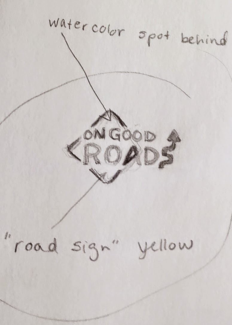
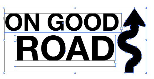
Next, I layered the black graphics I made in Illustrator over the top of the colored portion. I opened my .eps file in PS and selected all of the layer (Command/Ctrl+A), copied it (Command/Ctrl+C), and pasted it (Command/Ctrl+V) into my already open PS document (seen above). With the Move Tool I could position the lettering where I wanted it. By pressing Command/Ctrl+T I was able to adjust the size of the graphics in relation to the yellow sign (remember to hold the shift key to avoid any stretching).


Once I had everything centered and the sizes I wanted, I save my file first as a Photoshop file or .psd. That way if I need to adjust anything in the future, I can edit the layers individually. I also saved the file as a .png. A .png is basically a vector type file for the web. It can maintain a transparent background (unlike a .jpg) and also retains the crisp edges that vector files are known for.

Pro-tip: Never use a .png file for print or you'll end up with a weird box around your image. Use a .eps instead.

That's how my logo was done, people. Let me know if you have any questions.

Friday, March 27, 2015

LOGO CREATION | PART 2: WHERE THE MAGIC HAPPENS

Okay. As promised, here is the next part to my blog's logo creation. In my opinion, this is the more difficult part (and the part most designers have gone to school for (READ: get paid for), so you should feel very lucky that I'm letting you in on this secret ;) ).

With a pencil and paper it's very easy to add or take away whatever lines you want. Your imagination is the limit. But on a computer, you have to work with what you've got. That's why it's important to start with strong elements that will help you graphically (i.e. images/text with simple and clean lines...these will be the easiest to make into vector art for your logo).

If you remember, I'm starting from this sketch:


{Note: I'm just showing you how I created my design. There may be several ways to achieve the same results. Additionally, I'm simplifying the process because I created drafts of the logo and went back over it several times to modify the parts I didn't like or that didn't look great on the web...I'm just showing how to get to the final result.}

I decided to begin with making the arrow that acts as the "S" in Roads. I looked for a picture of a road sign with a similar arrow. I found one on the internet through a basic search (it definitely didn't have to be from the internet, but it's the easiest way to go.) Please be aware of copyright if you plan to copy any pictures from the internet. If you copy anything, make sure you are only using it to create a unique image of your own.

Designer sidenote: It's frustrating when people ask you to just copy something from the internet or make it look exactly like someone else's work. That's called stealing. Wouldn't you be mad if someone stole something you worked hard on and tried to pass it off as their own?

Anywaaaay...............
Once I found a picture I wanted, I copied it to my desktop and placed it into a new document in Adobe Illustrator. The document type doesn't really matter, I just used what was default for me (8.5x11 print).

{You'll have to excuse me as I'm still using CS3 on my personal computer (it works just fine for my needs!).}


When I placed my image into the document it was a little larger than I needed so I used the Selection Tool (black arrow) and held down the Shift key while dragging one of the white boxes in the corner of the image to resize it. It's very important to hold the shift key so that you don't stretch the original image. I see this is a very common problem for amateurs, and it makes for a very sad image.

Next, I clicked the Live Trace button in the toolbar at the top. This is my favorite feature in AI. It's magical. Essentially it turns an image from raster to vector. You want your logo to be in vector format because it's very crisp (it uses points vs. pixels) and can be easily scaled to any size without losing quality. There are different settings you can manipulate when using Live Trace, but because I picked a picture that was fairly graphic in the first place, I didn't have to change anything. Easy. To exit the Live Trace feature, I clicked Expand.

From there I right-clicked and ungrouped the pieces. I deleted all the elements except the arrow that I wanted to use. Then I created two text boxes with the Type Tool (the T). In one box I wrote "ON GOOD," and in the other, "ROADS." I did this so that it would be easy to move the two lines of type around freely. Once I had the blog name written out, I picked a font that I thought went well with the image I wanted to convey. I decided on a simple san serif that looks much like the type you would find on a road sign. I adjusted the kerning and tracking in some places to look better.
So here's where my logo was after all that work. My husband suggested making the arrow look more like the letter "S," and I agreed. To do that I had to use the Direct Selection Tool (white arrow). I moved the individual points at the bottom of the arrow to curve around a little more to the left. I also added an additional point with the Pen Tool to achieve that look.

Once I had everything arranged and looking nice I saved my file as a .ai (in case I have to go back and change anything in the original file) and as an .eps (this is one of several ways to save a vector image, and it's a file that I could import into Photoshop for the rest of my logo work).

I will have to explain the colored portion of the logo in a Part 3. Stay tuned.

Wednesday, March 25, 2015

LOGO CREATION | PART 1: BEHIND THE SCENES

A blog is a work in progress (at least that's how I'm seeing it). If you somehow discovered this blog on the very first days I posted, it looked quite a bit different than it does now. That's because I'm still figuring everything out (i.e. where to put columns and text, what pictures to include, how different fonts look together). These sort of things take time.

Today, I'm working on getting a logo in place so that this site doesn't look so much like a stock template. Here's where my logo was in the beginning:
Yeah, it's pretty bad. Nothing fancy. Aligned to the left. Gross for a blog title or capturing anyone's attention.

To begin (well, once you've determined a name for you blog/brand/etc, (which can take a while)), I like to sketch out my ideas. We're talking old school pencil and paper. It's so much easier to start on paper as it offers more freedom for you to jot down ideas. Incorporate things that you want to convey. Maybe your company is about coffee, so you want to include a coffee cup or a coffee bean or just a coffee ring leftover on a piece of paper. Whatever you think up, draw it! It doesn't have to be that great, just a sketch. Here are some of my sketches:


After I knew my blog/brand would be called "On Good Roads," I determined I wanted to include something about driving in the logo. I like road signs and did a basic web search for "road signs" to give me some ideas of where to start. I thought the car idea (above) was cute at first, but it was just too bulky for a logo. I had also brainstormed about turning the "A" in Roads into a vanishing point for a road disappearing into the horizon. But before I got to sketching that, I tried out a curved arrow as the "S" in Roads and really liked how that was looking.

{When creating a logo, I think it's best to start in black and white because, chances are, at some point you will need a basic black and white logo for printing (if you are serious about your brand anyway). Also, anything designed in black and white will look good in color. I promise.}


To add a touch of color and a nice "handmade" component to the logo, I decided to do a little spot of gauche (similar to watercolor) in the background. I pulled out my supplies...just used an old scrap piece of paper to paint on. It didn't need to be that big because I knew I could manipulate it on the computer later. The spot of color is yellow and in the shape of a road sign to further solidify my idea and make a cohesive logo. 


In Part 2 I'll explain the computer end of my logo work.

Tuesday, March 24, 2015

DELIVERED TO YOUR SCREEN FROM APT. 23


Hello there. From our sweet little apartment to yours
(or your car, or house, or boat, or wherever you are).

P.S. I may have locked myself out of our apartment for this picture. You're welcome.