Showing posts with label DESIGN. Show all posts

Thursday, April 27, 2017

LINOCUT PRINTMAKING PROCESS


I finally have my ornamental letter print finished and listed in the On Good Roads Etsy shop! I thought I would walk through the process of making the letter to give a better understanding of how printmaking works.

The word printmaking covers a wide array of fine art techniques in which an artist prints his or her work by hand or on a press. It is NOT printed digitally from a computer file on a modern printer. It is actually a hand-crafted piece of art much like an original painting or drawing...only it's usually possible to make several copies of the same thing...almost like a potter making a mould for a ceramic cup. Some types of printmaking include etchings, dry points, monoprints, woodcuts, silkscreen, and lithography.

In my case, I created a type of print called a linocut. A linocut is created from a linoleum block which is used as the inking plate to transfer the image. A crucial first step in making any art is to create a sketch of your idea. (See my sketching process for this print in my previous post.) I probably worked through about 10 different sketches for my ornamental letter A before settling on a "final draft." I don't always do sketches for everything I make, but I like to be prepared when I'm making a print because there is a lot of work involved, and I want to make my time and resources worth the effort.

My final sketch on top of white copy paper to help me visualize what size paper to print on.

As I was sketching my letter, I was thinking about what dimensions I wanted my final product to be. Because ornamental letters are often seen in old books and manuscripts, I thought I would create something with similar ratios. I chose to put my letter in a square but also wanted it to be a mid-sized piece of art that someone could hang in their living room to signify their family's last name or maybe a baby's nursery to signify a first name initial. I determined that my letter's dimensions would be 8 inches by 8 inches and that I would print on a piece of paper 11 inches by 14 inches (a standard framing size). I actually think this print would look great in a square frame but thought it would be easier for the general population to find a standard 11x14 or 16x20 frame matted to 11x14.

A look at the deckled/hand-torn edges of the Rives BFK paper.

For this print I used very nice printmaking paper called Rives BFK from France. It's a mouldmade paper and so it's edges retain a beautiful deckled look. Traditionally printmakers tear their paper and so having deckled edges already from the manufacturer helps to achieve that look. The paper is great because it's relatively heavy weight, acid-free and also 100% cotton. Conversely, my paper choice also made the printing process somewhat difficult because of the weight factor and because I'm printing by hand. Ultimately, I had a lot of it leftover from a previous project so instead of buying new stock I decided to work with what I have.

Once my design was finalized and I knew what dimensions I needed to make my print, I transferred my image onto a linoleum block. I like using the battleship grey linoleum. In this case I used an unmounted block and cut it to size and mounted myself to a piece of leftover masonite/hardboard. Doing this also cuts down on the thickness and weight of the block (which is nice when it comes to storage) instead of buying one already mounted (which is also more expensive). Before transferring an image to any printmaking plate/block it needs to be reversed so that when you print it on paper it will be right-reading just like with any kind of stamp.

Transferring my design to the mounted linoleum using carbon paper.

To reverse an image you can either find a copy machine with those capabilities or scan your image and reverse it in photo editing software or when you print a copy. Just make sure that the reversed image will still retain the proper dimensions. When the image is reversed, transfer it to the linoleum. There are a few methods to do that. You could rub charcoal on the back side of the copy of your design, place that on the block, and trace over your image. The pressure from the tracing will transfer the charcoal into lines so that they can be carved. The method I used was carbon paper. Simply place a sheet between your reversed design and the block, tape down, and trace away. The image lines transfer pretty crisply and they don't smudge so easily. Some people prefer to draw directly onto their blocks with a permanent marker, but I like to be prepared with my designs and transfer an image that I know will look good when printed in reverse of what's on the block. Some kinds of blocks allow you to iron a printed image onto them, but battleship gray linoleum is not one of those kinds.

The transferred design (in reverse) ready to carve!

The carved design!

Once the design was on the block, I carved it out. Linoleum carves out relatively easily as long as the block you're using isn't too old and your tools are sharp. For now I am using a basic speedball linoleum carver. After carving I prepared my paper by tearing it to the proper dimensions and labeling lightly in pencil which side was front. I also set up my printing jig so that when I print the paper, it will leave the proper amount of white border around the final print. I created my own system to do this and it will change for any printed piece you create.

Lining up the block in my handmade jig to set it for paper registration.

Next I set up my printing station. (You'll have to use your imagination to picture this as I didn't snap any photos this time.) I use black oil-based etching ink because it allows more versatility for a print. Because etching ink is typically more viscous, adding some burnt plate oil helps to get it to the proper consistency for block printing. Ink consistency may also need to change based on the type of paper you use or depending if you put your paper in a bath before printing.

I have a glass pane where I roll out the ink with a speedball brayer. A putty knife is helpful in moving ink about on the pane as well. It's handy to have some rubber gloves, old phone book pages, vegetable oil, laundry detergent, and an old rag on hand for keeping the station clean and tidy while printing. That's one of the most difficult parts as you want your final product to stay as beautiful as possible.

When the ink is rolled to the right consistency, it's time to ink up the block with the brayer and put it in the jig. It's important to cover the block completely and thickly enough with ink (but not too thick) to get a solid print. It depends what look you want to achieve, but I like my prints very solid and graphic and clean. It does help to make some test prints on newsprint before actually using your good paper. That way the block gets used to the ink and your coverage will be good.

The inked block before printing.

Once the block is inked, I place it into my jig. Then I line my paper up face down according to my registration pins. The paper lays on top of the inked block, and I place a piece of newsprint over that and start to hand-press the paper together with the block. I also use a Japanese barren and an old wooden spoon to rub over the paper to get a solid transfer. At times I will peel back a portion of the print to see if it needs more work. If it does I gently lay it back down to continue pressing. When I get it to a point where I like it, I carefully peel the paper off the block being careful not to smudge up any part of the paper.

Seeing the final product is always magical. I find printmaking be an art form in two ways. First, an artist needs to create an idea for a piece of art. Second, the artist needs to convey that idea in the printing method and with perfect execution. The actual printing process takes as much skill and practice as it does to come up with an idea as an artist. But that is why I find printmaking to be a very satisfying art...it's a challenge in more than one way.

Monday, March 13, 2017

FROM THE STUDIO: CREATING ILLUMINATED / ORNAMENTAL LETTERS

Knackfuss, H. Dürer (Bielefeld, DE: Velhagen & Klasing, 1900)

Since I have been reading so many calligraphy books lately, one topic I see mentioned over and over again is that of creating illuminated letters. Illuminated letters are those that are decorated, usually with gold leaf and other colors. They were typically the first letter of a page or paragraph that was enlarged and supplemented with images like animals, plants, or mythological creatures. Other terms that could be used to signify an illuminated letter are decorated letters or ornamental letters.

While researching this topic and looking into to so many variations of letters throughout the centuries, I decided I wanted to make some letters of my own. I've been busy sketching out lots of ideas and writing a list of goals that I want to accomplish with my letters.


Something that I decided not to do was the actual "illuminated" part. I really like the idea of keeping it simple by having plain black and white ornamentation without the coloring (which I think can look gaudy at times, but hey, that was the style at one time). I would not be opposed to adding gilding or embossing, but I don't have the materials for it at this point. Maybe that's something I can think about for the future, but for now I think it's plenty challenging to create an ornamental letter in one color.

Another goal I want to achieve with my letters is that I want them to have a modern feel. That was also why I decided to leave out any coloring and go with just black and white. An additional way I thought to make my decorated letters more modern was through the imagery. I still wanted to keep the letters ornate and detailed, but I didn't think having cherubs or dragons was a way to do that. Instead, I've planned to used succulents as the basis for my background decoration. Succulents still keep with traditional plant decoration, but they have become increasingly popular as of late.

I believe I have a final sketch ready for my ornamental letter A. I don't intend to leave this as a drawing though. How could I? I love printmaking, and the boldness of these letters are just asking to be carved and printed from a block. So that's what I'll be working on finishing soon.


Friday, March 03, 2017

PERSONALIZED WEDDING ANNIVERSARY MILESTONE GIFT


My parents are reaching a significant milestone in May. They will have been married for forty years! That's a pretty long time and quite a remarkable accomplishment if you ask me. Marriage isn't always the easiest, but they've managed to make it work. For their anniversary I made a hand-lettered design as a gift they can display in their home.

I've made similar ones to this in the past for my in-laws and a card version for mine and Caleb's first anniversary. (I know, I know, my math was wonky on these.)


Friday, April 17, 2015

NEW SEASON = NEW WREATH


Since Caleb and I got married and moved into our first apartment, I've made a new wreath for each of the seasons. These wreaths were made without spending any money, too. That's because we're on a bit of a grad school budget over here (aka: only the necessities). But really, it hasn't been hard to make nice looking wreaths while just using materials I already have lying around.

Here's what I did for fall and winter:


For the fall wreath I used a coat hanger, paper clips, hot glue, pinecones spray-painted teal, and chevron burlap ribbon (the ribbon and pinecones were leftover from our wedding).

For the winter wreath I used cardboard, hot glue, paper straws, jute twine, and white acrylic paint (again, the twine and straws were leftover from our wedding).

For spring I wanted to break away from the color scheme we used for our wedding. I also wanted to do something that I could leave up for spring and summer because we'll be moving (temporarily) for the entire summer.

I found this gorgeous wreath on Jones Design Company and knew I wanted to do something similar.
I followed her tutorial for turning coffee filters into paper flowers. It seemed daunting at first, but the more I made the flowers, the easier it got.

I only used three colors of paint: white, yellow, red. I toned down both the red and yellow with white and mixed water with each of them, thus resulting in two colors. For some flowers I only used the red mixture to dye the coffee filters. For others I used only the yellow. And for a third variation I dipped a filter in red and then in yellow. I just played around with the tones and diluted the filters if I thought they had too much color. For the final wreath I also used undyed coffee filters for the white flowers.

Here are my filters as they were drying:


Once dry, I shaped them all into flowers and hot-glued them to a cardboard circle. It took a little while, but I really like how it looks (and it was free!). I think I may even make a few more and attach them to sticks to look like stems...because the flowers looked real pretty in a glass jar.

Tuesday, March 31, 2015

LOGO CREATION | PART 3: COLOR + SAVING FILES

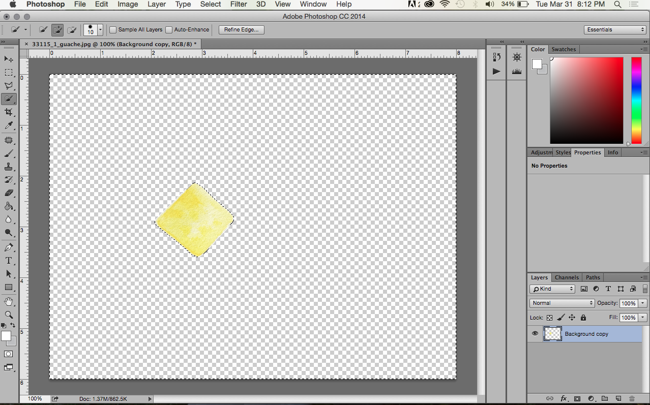
In order to create the colored portion of my logo, I first created a little gouache painting (similar to watercolor) of the yellow sign that I wanted to include behind the type. I like the look that a small handmade portion of the logo gives for use on the blog. It's a good contrast to the bold graphic quality of the letters/arrow and adds an element of fun.

After creating the painting, I took a picture of it. Here is the unedited picture (kind of dark...I know):


Once I had the photo, I opened it up in Photoshop (PS) to do a little editing.

It's always a good rule to copy your background layer into a new layer (within the Layers window). Do this just in case you have to revert back to it (it happens more than you would think).
Once I had a copy of my background, I brightened the image. There are many ways to brighten a picture in PS, but I like to go to Image>Adjustments>Brightness/Contrast. In this case, I adjusted both the brightness and the contrast to brighten the whole image and to keep some of the texture from the paper...I like the texture.


Next, I cut out the colored part of the image. I did this by using the Quick Selection Tool. I selected the portion I wanted (to subtract portions, just hold the Option/Alt key and select) and went to Select>Inverse. Now the portion selected is the background and not the colored part. I hit the Delete button to get rid of it so that my new background is transparent. (I also deleted the original background image.)

I wanted a transparent background in this case because the background on my blog is white, and it would be nearly impossible to get my .jpg image to replicate the same white. I also changed the size of the background to fit the pixel dimensions of my blog header: under Image>Canvas Size. I also added guides to my document so that I would be able to center everything easier.

Next, I layered the black graphics I made in Illustrator over the top of the colored portion. I opened my .eps file in PS and selected all of the layer (Command/Ctrl+A), copied it (Command/Ctrl+C), and pasted it (Command/Ctrl+V) into my already open PS document (seen above). With the Move Tool I could position the lettering where I wanted it. By pressing Command/Ctrl+T I was able to adjust the size of the graphics in relation to the yellow sign (remember to hold the shift key to avoid any stretching).


Once I had everything centered and the sizes I wanted, I save my file first as a Photoshop file or .psd. That way if I need to adjust anything in the future, I can edit the layers individually. I also saved the file as a .png. A .png is basically a vector type file for the web. It can maintain a transparent background (unlike a .jpg) and also retains the crisp edges that vector files are known for.

Pro-tip: Never use a .png file for print or you'll end up with a weird box around your image. Use a .eps instead.

That's how my logo was done, people. Let me know if you have any questions.

Friday, March 27, 2015

LOGO CREATION | PART 2: WHERE THE MAGIC HAPPENS

Okay. As promised, here is the next part to my blog's logo creation. In my opinion, this is the more difficult part (and the part most designers have gone to school for (READ: get paid for), so you should feel very lucky that I'm letting you in on this secret ;) ).

With a pencil and paper it's very easy to add or take away whatever lines you want. Your imagination is the limit. But on a computer, you have to work with what you've got. That's why it's important to start with strong elements that will help you graphically (i.e. images/text with simple and clean lines...these will be the easiest to make into vector art for your logo).

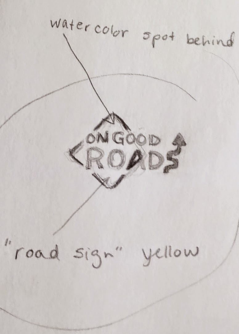
If you remember, I'm starting from this sketch:


{Note: I'm just showing you how I created my design. There may be several ways to achieve the same results. Additionally, I'm simplifying the process because I created drafts of the logo and went back over it several times to modify the parts I didn't like or that didn't look great on the web...I'm just showing how to get to the final result.}

I decided to begin with making the arrow that acts as the "S" in Roads. I looked for a picture of a road sign with a similar arrow. I found one on the internet through a basic search (it definitely didn't have to be from the internet, but it's the easiest way to go.) Please be aware of copyright if you plan to copy any pictures from the internet. If you copy anything, make sure you are only using it to create a unique image of your own.

Designer sidenote: It's frustrating when people ask you to just copy something from the internet or make it look exactly like someone else's work. That's called stealing. Wouldn't you be mad if someone stole something you worked hard on and tried to pass it off as their own?

Anywaaaay...............
Once I found a picture I wanted, I copied it to my desktop and placed it into a new document in Adobe Illustrator. The document type doesn't really matter, I just used what was default for me (8.5x11 print).

{You'll have to excuse me as I'm still using CS3 on my personal computer (it works just fine for my needs!).}


When I placed my image into the document it was a little larger than I needed so I used the Selection Tool (black arrow) and held down the Shift key while dragging one of the white boxes in the corner of the image to resize it. It's very important to hold the shift key so that you don't stretch the original image. I see this is a very common problem for amateurs, and it makes for a very sad image.

Next, I clicked the Live Trace button in the toolbar at the top. This is my favorite feature in AI. It's magical. Essentially it turns an image from raster to vector. You want your logo to be in vector format because it's very crisp (it uses points vs. pixels) and can be easily scaled to any size without losing quality. There are different settings you can manipulate when using Live Trace, but because I picked a picture that was fairly graphic in the first place, I didn't have to change anything. Easy. To exit the Live Trace feature, I clicked Expand.

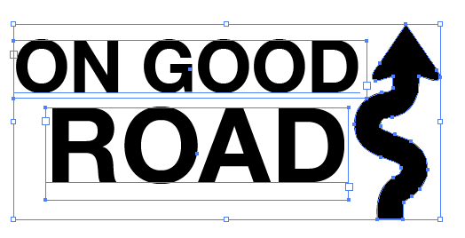
From there I right-clicked and ungrouped the pieces. I deleted all the elements except the arrow that I wanted to use. Then I created two text boxes with the Type Tool (the T). In one box I wrote "ON GOOD," and in the other, "ROADS." I did this so that it would be easy to move the two lines of type around freely. Once I had the blog name written out, I picked a font that I thought went well with the image I wanted to convey. I decided on a simple san serif that looks much like the type you would find on a road sign. I adjusted the kerning and tracking in some places to look better.
So here's where my logo was after all that work. My husband suggested making the arrow look more like the letter "S," and I agreed. To do that I had to use the Direct Selection Tool (white arrow). I moved the individual points at the bottom of the arrow to curve around a little more to the left. I also added an additional point with the Pen Tool to achieve that look.

Once I had everything arranged and looking nice I saved my file as a .ai (in case I have to go back and change anything in the original file) and as an .eps (this is one of several ways to save a vector image, and it's a file that I could import into Photoshop for the rest of my logo work).

I will have to explain the colored portion of the logo in a Part 3. Stay tuned.

Wednesday, March 25, 2015

LOGO CREATION | PART 1: BEHIND THE SCENES

A blog is a work in progress (at least that's how I'm seeing it). If you somehow discovered this blog on the very first days I posted, it looked quite a bit different than it does now. That's because I'm still figuring everything out (i.e. where to put columns and text, what pictures to include, how different fonts look together). These sort of things take time.

Today, I'm working on getting a logo in place so that this site doesn't look so much like a stock template. Here's where my logo was in the beginning:
Yeah, it's pretty bad. Nothing fancy. Aligned to the left. Gross for a blog title or capturing anyone's attention.

To begin (well, once you've determined a name for you blog/brand/etc, (which can take a while)), I like to sketch out my ideas. We're talking old school pencil and paper. It's so much easier to start on paper as it offers more freedom for you to jot down ideas. Incorporate things that you want to convey. Maybe your company is about coffee, so you want to include a coffee cup or a coffee bean or just a coffee ring leftover on a piece of paper. Whatever you think up, draw it! It doesn't have to be that great, just a sketch. Here are some of my sketches:


After I knew my blog/brand would be called "On Good Roads," I determined I wanted to include something about driving in the logo. I like road signs and did a basic web search for "road signs" to give me some ideas of where to start. I thought the car idea (above) was cute at first, but it was just too bulky for a logo. I had also brainstormed about turning the "A" in Roads into a vanishing point for a road disappearing into the horizon. But before I got to sketching that, I tried out a curved arrow as the "S" in Roads and really liked how that was looking.

{When creating a logo, I think it's best to start in black and white because, chances are, at some point you will need a basic black and white logo for printing (if you are serious about your brand anyway). Also, anything designed in black and white will look good in color. I promise.}


To add a touch of color and a nice "handmade" component to the logo, I decided to do a little spot of gauche (similar to watercolor) in the background. I pulled out my supplies...just used an old scrap piece of paper to paint on. It didn't need to be that big because I knew I could manipulate it on the computer later. The spot of color is yellow and in the shape of a road sign to further solidify my idea and make a cohesive logo. 


In Part 2 I'll explain the computer end of my logo work.